Story Activity, Pivotal Tracker
UX Design, Interviews, Concept Testing, Wireframing, Design Lead
Re-designing story activity
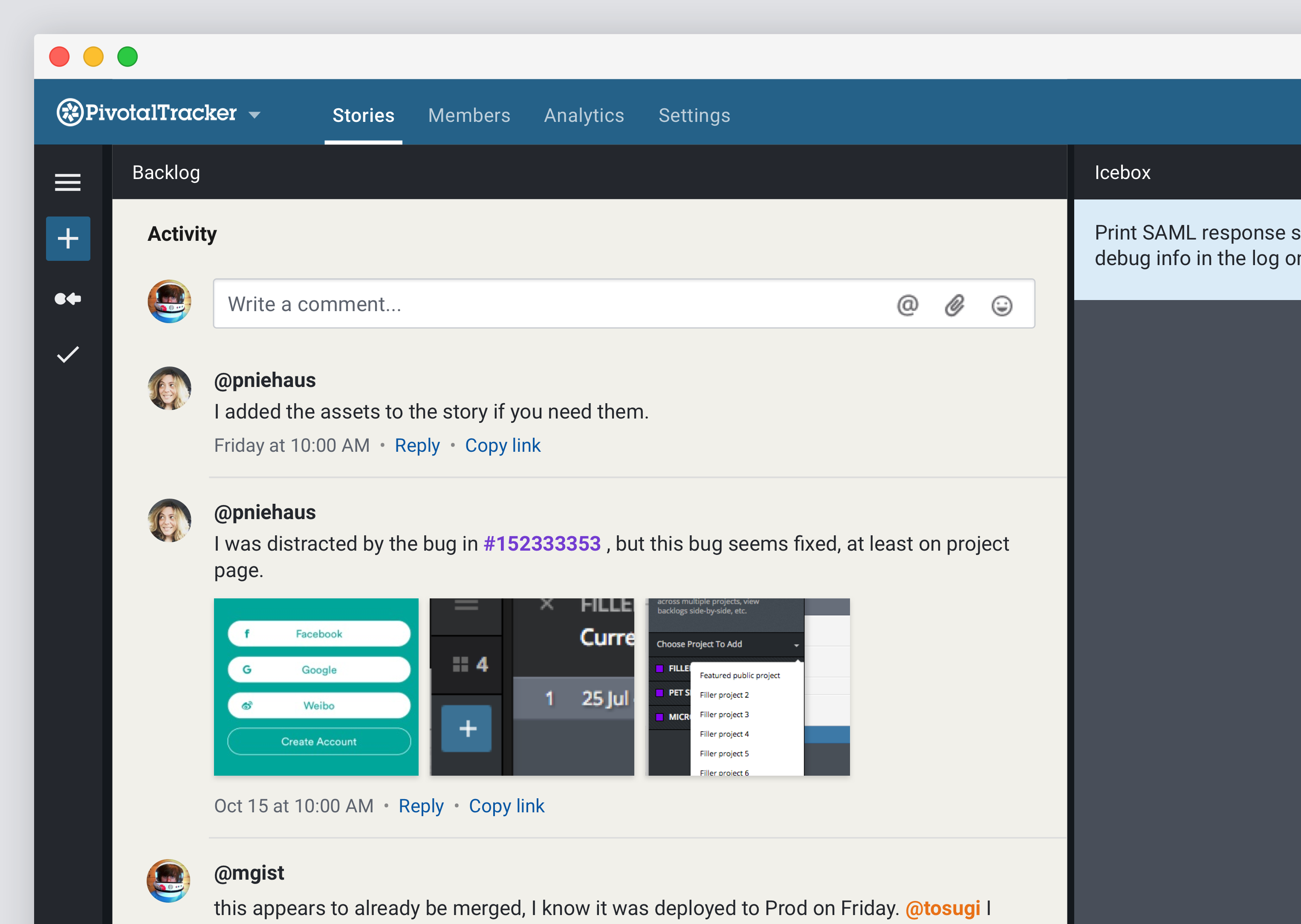
The goal of this project was to put the focus on the content and make it easier for users to consume the content. We’ve removed a lot of the visual noise found in Story Activity. There are far fewer boxes, borders, and patterned textures—it looked like stories were wearing sweaters—than in the previous design. Making this area cleaner and simpler allows for more focus.

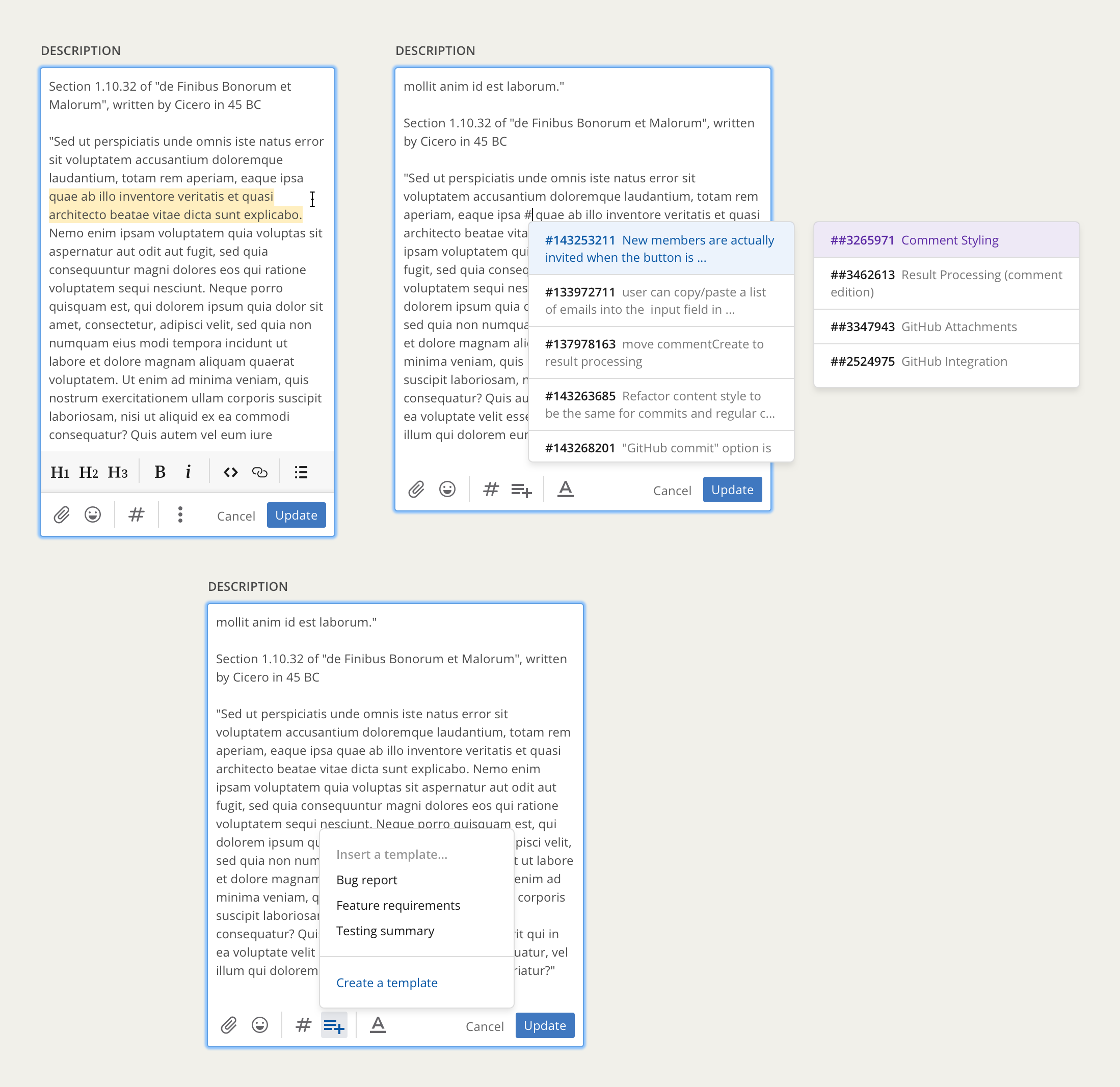
We also did a lot around interactions and the editing experience. I explored different directions on how we could handle markdown editing tools and other ways to make it easier for our users to communicate with their team.

The impact
After launching the initial version of the re-design, we found that usage of the Reply option on comments rose to 100% of daily active users. This was a result of having the comment controls more visible and relying more on text as opposed to just icons. We are continuing to measure usage, get feedback from users, and iterate on the design.